Rebrand - iap2 - International Assn. For Public Participation
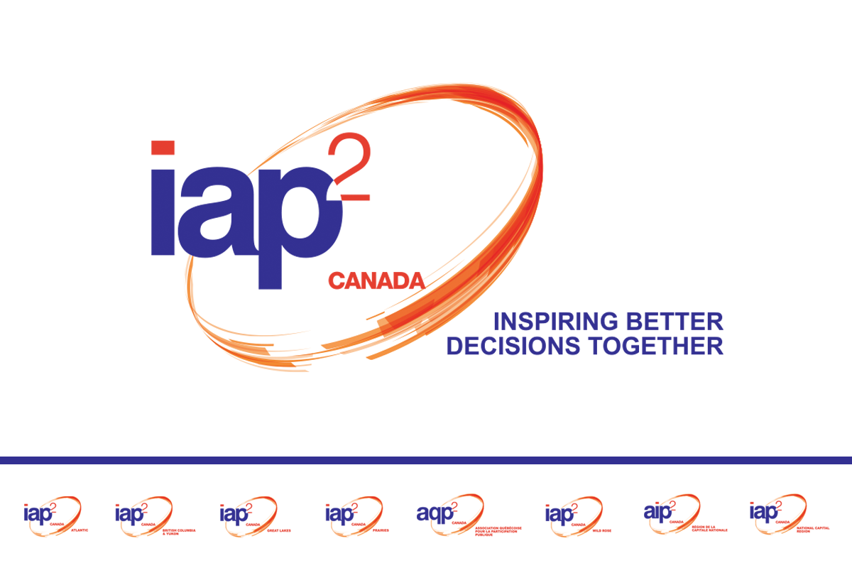
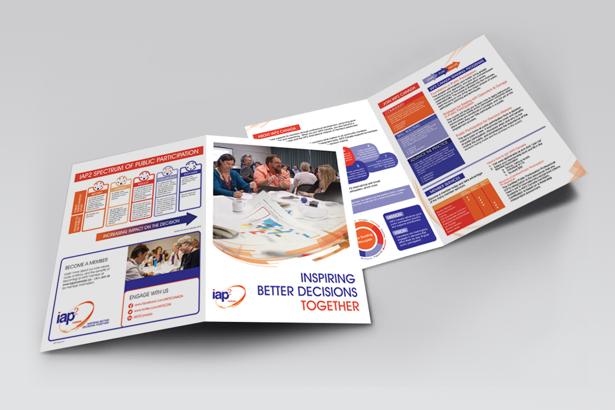
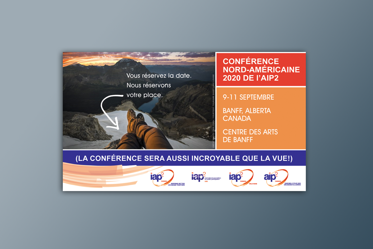
iap2 is an international organization whose mission is to advance and extend the practice of public participation through professional development, certification, standards of practice, core values, advocacy and key initiatives with strategic partners around the world.
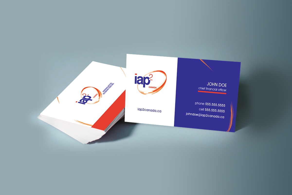
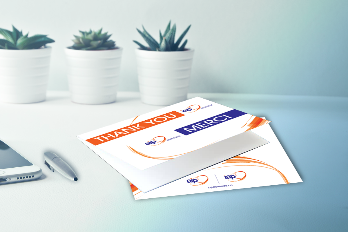
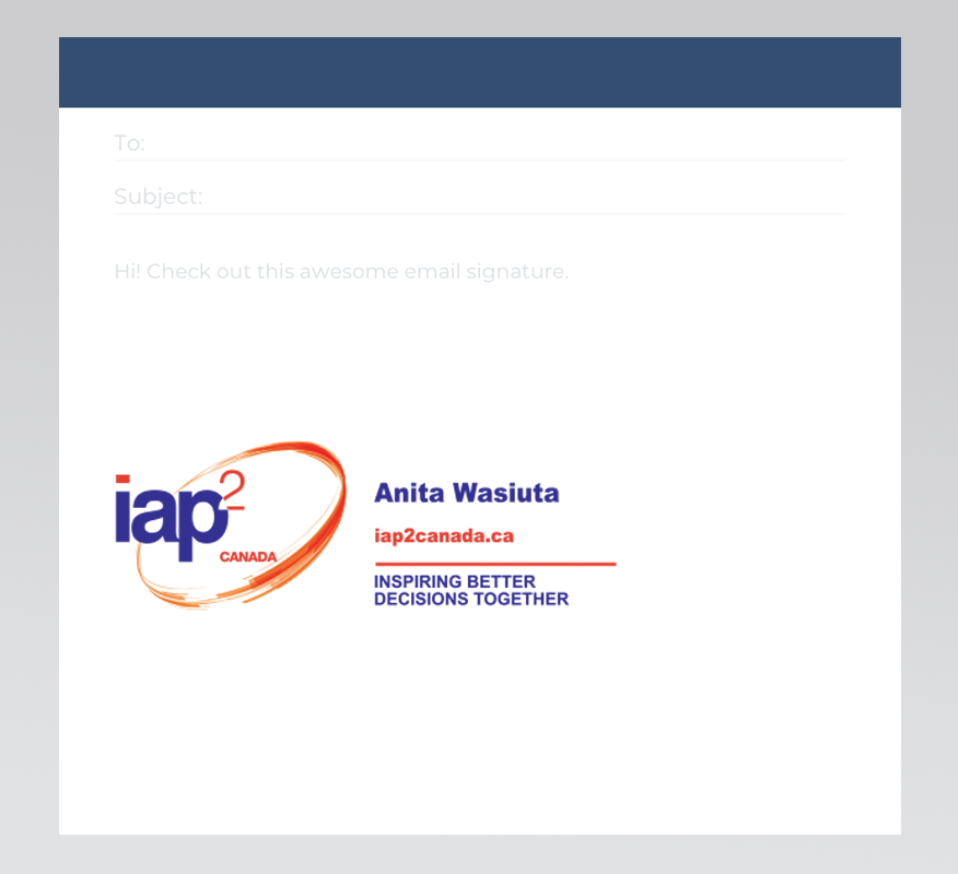
This client was looking for a strong, unified brand with purpose as a way to connect members to the brand emotionally, and create a better sense of community within the organization. As well as wanting to use colours & symbols which reflect the iap2 brand principles. (Purple symbolizes knowledge, sharing & wisdom, orange symbolizes enthusiasm for the practice of public participation, circle symbolizes support for P2 & togetherness through connectivity).
Everything from internal to external communications were developed in French and English.